How to create the perfect logo for a photographer?
Creating the perfect logo for a photographer is much more important than it seems. It is the most succinct way to present your photography business. A good logo will increase direct communication, enhance customer loyalty, create a market identity and convey professionalism.
In this article where we will reveal how to create the perfect logo for a photographer, you will discover a few tips and examples when creating your logo.
At Arcadina we want your photography website to transmit a solid, reliable and recognisable brand identity.
Contenido
- Tips for creating the perfect logo for a photographer
- 1- Simple and straightforward logo
- 2- Observe and study the logos of your competitors
- 3- Use quality typography in your company logo
- 4- Use a logo that “illustrates” your business
- 5- Create a logo that lasts over time
- 6- Use the colour of your brand in your logotype
- 7- Scalable and versatile logo
- 8- An original logo is always a good option
- Final recommendation for creating the perfect logo for a photographer
- Open the door to your photography business
- Nature photographer: turn your photos into a source of income while continuing to travel
- Tips for expanding and improving your photography website
- Guide for your Christmas campaign in 2021
Tips for creating the perfect logo for a photographer
Below we are going to give you a series of simple tips and recommendations so that you can design your own logo that represents your essence as a photographer. And as always, we will accompany these tips with several real examples.
Discover how to create the perfect logo for a photographer is very simple.
1- Simple and straightforward logo
It is clear that creating the perfect logo for a photographer is not as easy as it seems, many times you have an idea in your head and when it comes to putting it down on paper you can end up adding too many details and elements to the logo.
An example of a cluttered logo would be one that has all of these elements at once (which you should avoid):
- An icon of a camera.
- On one letter of the photographer’s name (usually “o”) draw a target.
- Add a background photograph.
- Abuse of colours, effects, shapes and details.
The end result of this fictitious logo will be an illegible mark that is difficult for your clients to visualise. To create the perfect logo for a photographer and for it to work, the first thing you have to take into account is that it should be simple and easy to remember. To achieve this goal, synthesise your idea as much as possible, eliminate details and keep only the essentials.

Alfi GomezEstudio logo. Simple and clear, without ornamentation.
Many times we are guilty of overdoing it when it comes to adding shapes and colours. Don’t think too much about it, in most cases, what really works is the simplest, cleanest and most concise possible. Think that your logo, at a glance, has to give your client two very important pieces of information: Who are you? And what do you do?

Héctor Hernández Audiovisual logo. The logo goes with the aesthetics of the rest of the website.
2- Observe and study the logos of your competitors
In this recommendation we would like to stress that observing is not the same as copying. We advise you to study the logos of your fellow photographers that may be a competition for you, but never copy them. If you do, you will lose your brand identity and become a mere copy of your competitors.
One example:
Does your competitor use classic, italicised text in their logo? Go the other way and, if it’s in keeping with your photographic style, use a more modern line with an explosive font that sets you apart in your area.
The aim when creating your logo is to ensure that customers, when they see your brand, recognise you immediately. You should aim to distinguish your photography business from the rest of the competition with the help of your logo.
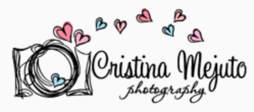
Logo of Cristina Mejuto Photography, this photographer has included a drawing with childish strokes and a more rounded font style to give a more childish air to her logo.
One idea you can employ when designing your logo is to use the colours of other elements of your brand or you can even play with the initials of your name to create an original composition. Think that your logo should be unique enough for people to immediately identify it with your photography business. Take a cue from the big guys. Look at the simplicity and eye-catching nature of some of the world’s most famous logos such as Apple, Nike or McDonald’s.

If you look at Alicia Fernández Alpuy‘s logo and analyse it, you will see that it is closely related to her name:
- On the one hand, he takes the first of his initials (A) and modifies it to look like a camera lens.
- And he also plays with his own initials to create his logo.
Without a doubt, this is a well thought-out logo that will leave a mark on your customers.
3- Use quality typography in your company logo
If you are one of the photographers who have chosen to create the logo of your brand with typography only, without accompanying it with any image, you must take the following aspects into account:
- The typeface should be in line with the message you want to convey.
- As the logo will be highly visible on your website, you should try to choose a typeface that is legible, to ensure that the message is conveyed in the way you intended.
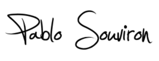
PabloSouviron‘s signature logo, which undoubtedly gives his work a personal character.
Depending on the type of typography you choose, you will be able to convey a very specific feeling and personality that should be in line with the style of photography you do.
If, for example, your photography business is focused on weddings, a more refined font is likely to be your best choice. And for a photography studio whose focus is on creative photography and where every image is a work of art, the logo can have some creative element such as a font created by the author himself.
4- Use a logo that “illustrates” your business
If you add an illustration to your logo, you will let people know at first glance what you do. Logos that include an image or graphic provide much more complete and visual information.
And what elements represent an image professional? A camera or, for example, a lens that attracts the attention of your customers. In this type of logo, you have to know how to choose very well which images to include, so as not to confuse your visitors.
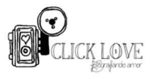
Click Love logo, where in this case, the drawing of the camera reinforces the brand message.
You should try to avoid clip art as much as possible. As tempting as it may be, it is better to avoid this type of illustrations (clip art, etc.). Not only are they perceived as “cheap”, but they can be copied very easily and you will find another photographer with your logo, losing its uniqueness.
It is also important that you avoid background photographs, which may be fine for the web, but in certain print products they end up being of poor quality. The best thing to do is to get in the hands of a designer who will allow you to achieve a much more professional result in a short time. And if you don’t want to spend money, with graphic design software and a bit of practice it is also possible to create your own logo.

AbelSogues, in addition to combining various typography styles, has also opted to include a drawing of a camera in its brand logo.
5- Create a logo that lasts over time
The truth is that you can’t redesign your logo every year, so trying to adapt it to the fashion of the moment is a huge mistake that will force you, in the long run, to have to modify its design.
Constantly changing the style of your logo can be confusing for your customers. So it is much more advisable to project a brand that lasts over time and that you can use for years.

Here the logo of the Caminante de Montes website makes it clear both what he does (photographer) and his speciality (landscape photography), both with the text and the chosen drawing.
Analyse your brand in depth and look for the differentiating element for which you want to be remembered. It could be the type of photography you do or your name, for example. And once you are clear about the part of your brand that you want to be identified by, highlight it in a subtle way and ask yourself the following question: Will I still like this logo in 10 years? If your answer is Yes. Go ahead, you have found the logo that represents you.
Don’t be afraid of becoming outdated, over time your logo will reflect the original spirit of the business, giving your work a sense of class. A good logo is one that doesn’t follow fashion. Get rid of gradients, shading and trendy fonts. And create a logo that lasts through the years.
6- Use the colour of your brand in your logotype
Logos should have at most 1 or 2 colours, a neutral tone and another one that distinguishes your commercial brand and that you can include in the rest of your products, studio, folders, albums, etc.
Ideally, in addition to this colour logo, you should also create a black and white version and check if it reads correctly in different products.
Imagine that your logo has to be printed in a black and white album or advertisement, you have to make sure that it will look good. A logo with 5 colours can be much nicer than one with 2 or 3, but in the future the printing costs will be much higher.

In the logo of Karma Estudio Audiovisual, the combination of pink and black gives a very original touch to the name of your photography company. As you can see, you don’t need anything else to make an impression with your logo on visitors.
When it comes to designing the perfect logo, the ideal is to combine several of the ideas we are showing you in this article.
7- Scalable and versatile logo
Another aspect to bear in mind when creating your logo is that it must be scalable to very small sizes without losing legibility.
Imagine your website being viewed on a mobile phone or the size of your logo on a business card.
On the Internet it is not worth taking a gamble, so it is important to create a logo that works well on any size and device (PC, Smartphone, Tablet, Mobile, etc.).
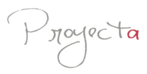
As you can see, the Proyecta foto logo is simply a thin line with its name and a small colour detail. No doubt this logo will work perfectly at any size and will be correctly identified from any device.
If you choose to create an impactful logo that your visitors can easily remember, make sure you synthesise the information so that they can recognise it on any device or medium.

This is the case of the GNOFOTO logo where they have synthesised the name of the brand and thanks to the combination of colours and typographies it will be very easy to recognise in any medium.
8- An original logo is always a good option
As we said at the beginning, it is not a good idea to copy the logo of your colleagues, even if you change the font or add a photo.
It is clear that you have to look and think a lot to get good ideas, and with so much competition it may seem impossible to do something different. But even if it’s hard, the ideal is that you come up with a logo that is original and different from those of other photographers. Ideally, your logo should be based on an original idea, and should not look like any other logo you have seen before in your area.

A fresh and fun logo is what you will find in Sara Alarcón. This photographer specialises in photography of pregnant women, children and newborns and as you can see, her logo is very much in keeping with her type of public.
Including an element that alludes to your type of photography will also make your brand logo more original.
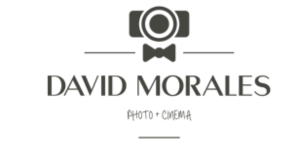
In the logo representing wedding photographer David Morales, the detail of the camera icon and the bow tie make his specialisation clear.
Final recommendation for creating the perfect logo for a photographer
There is no doubt that creating the perfect logo for a photographer will serve to enhance your business. Because at the end of the day, your logo is your symbol and it is a graphic element that represents you in different media.
Your brand logo will be the first thing your visitors will notice when they enter your photography website. So if you want your website to stand out, your logo needs to stand out too.
Take care of your logo and you’ll be taking care of your photography business.
>> New: customise the logo in each section of your website
In most cases, your logo will also become your watermark. Here are the ones most commonly used by your fellow photographers.
>> The most used watermarks by photographers
Did you know that with Arcadina you have an automatic logo generator?
Gloria from Fotograma Vitoria wanted to share with all her colleagues her experience with us. Here is her interview.
>> Interview with Fotograma Vitoria
If you also want to share your opinion about Arcadina with the rest of your colleagues, you can send us an email or leave a comment on Social Networks.
At Arcadina we want to know all the details to create the perfect logo for a photographer, so before we say goodbye until the next post, we would like you to tell us how was the process of creating your logo and if you are satisfied with the result. We’ll read you in the comments!
Open the door to your photography business
Fulfil your dreams and develop your professional career with us. We offer you to create a photography website for free for 14 days so you can try our platform without any commitment of permanence.
Arcadina is much more than a website, it is business solutions for photographers.
If you have any queries, our Customer Service Team is always ready to help you 24 hours a day, 7 days a week. We listen to you.

