UX in photography: how to improve the user experience on your photography website
The user experience on your photography website (UX) is a concept that, at first glance, may seem abstract or reserved only for web designers and marketing experts. However, its impact goes far beyond that. If you are a photographer and you have a website, UX plays a key role in the way your visitors interact with your site. An intuitive and pleasant navigation not only improves your users’ experience, but can also help you rank better on Google.
Photographers often overlook the importance of taking care of the UX on their websites, but the truth is that it is an essential factor for visitors to have a pleasant experience when they get to know your brand. And to help you in this improvement process, in this article, we are going to explain everything you need to know to optimise the user experience on your photography website.

Find out everything you need to know to improve the user experience on your photography website.
Contenido
- Steps to improve the user experience of your photography website
- Intuitive design on your photography website: improve the experience of your visitors
- Web accessibility in photography: make your website accessible to everyone
- Photo galleries: showcase your work professionally
- Functionality and performance: keys to a faster, more efficient website
- Effective interaction and feedback on your photography website: key elements of communication
- Consistency in your visual identity: strengthen your brand image
- HTTPS security: create a link of trust
- Mobile version of your website: make the experience a satisfactory one
- Relationship between SEO and UX positioning
- Extra tips to improve the UX of your photography website
- Improve the user experience on your photography website and turn visitors into customers
- Arcadina goes with you
- New SEO 2020. Is your photography website optimized for the new Google?
- Why is a FAQ section on your photography website the best solution to gain visibility on Google?
- SEO guide for photographers: learn how to improve your photography business's web positioning
Steps to improve the user experience of your photography website

You may be wondering what exactly UX (or user experience on your photography website) means. This acronym comes from “User Experience”, which in English translates as user experience. UX is one of the fundamental pillars of web design and plays a key role in the way people interact with your site. Not only does it improve the experience of those who visit your website, but it can also benefit your search engine rankings if you use it correctly.
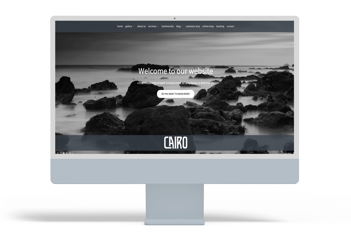
On a photography website, the user experience is essential for your visitors to enjoy the visual content in an attractive and satisfactory way. The UX aims to create a smooth and pleasant navigation, taking into account aspects such as ease of use, accessibility and the web.
Here are the key things you need to consider to optimise the user experience on your photography website.
Intuitive design on your photography website: improve the experience of your visitors

Web design is the foundation on which your website is built and defines how users interact with it. You may not have paid much attention to it, but the structure of your site, menu layout and content organisation can make the difference between a smooth navigation or a frustrating experience that causes visitors to leave early because they can’t easily find the information they are looking for.
To improve the user experience, it is essential that you put yourself in their shoes to design a website with their comfort in mind. Information should be clear, concise and easy to process and locate to keep the visitor’s attention. If your site has too many sections that are poorly organised or difficult to find, it is likely that users will not find what they are looking for and will leave the site quickly.
Therefore, when designing your photography website, it is important that you opt for an intuitive and orderly navigation structure, which allows your potential clients to easily access key content such as: image galleries, your services pages, biography, contact page, testimonials or blog articles. To improve usability, you can also include visual elements that guide visitors in a natural way, such as direct access buttons, strategic links to other important parts of your website, image galleries to separate information and achieve a more dynamic reading or customised contact forms according to the type of service you are offering.
Web accessibility in photography: make your website accessible to everyone
Accessibility is a key aspect of user experience (UX) that is often overlooked. A photography website should be inclusive and easy to use for everyone, including people with visual or hearing disabilities. To achieve this, it is essential that you use ALT tags on images, providing clear descriptions of their visual content. This allows screen readers to interpret photographs correctly, improving the experience for those who rely on these tools.
Furthermore, optimising accessibility not only benefits users, but will also improve your Google ranking. And since search engines cannot yet interpret images on their own, ALT tags are what will help index them correctly, increasing the visibility of your website.
Photo galleries: showcase your work professionally

Photographs are the heart of your business and should also be the heart of your website, so it is essential that you display them in an attractive and professional manner. To achieve this, you can use a design that enhances your images, ensuring that they are displayed at a suitable size, with sufficient quality to appreciate every detail but with the assurance that they cannot be used inappropriately without your permission and with a fast loading speed. A well-designed visual presentation not only captivates your visitors, but also enhances their experience on your website.
In Arcadina you will be able to create all the image galleries and sub-galleries you need to include the best photos of each report. When a client or visitor enters your website, they will be able to view each image in full screen. And the best of all is that on our websites the images are automatically optimised. If you want to know more about this topic do not hesitate to read the following article of our help.
>> Learn how to optimize the size and resolution of your web images
Functionality and performance: keys to a faster, more efficient website
To improve the user experience on your website, it should be as functional and error-free as possible. Therefore, it is crucial that you carry out a series of periodic reviews to avoid, as far as possible, as many problems as possible. The most common ones tend to be:
- Internal and external links that do not lead to any content.
- Contact forms that do not work properly or lack clarity of information.
- Badly redirected shortcut buttons.
- Contact information with some typos.
- Etc.
In addition, the performance of your website is crucial. Users expect loading times to be as fast as possible, especially when it comes to viewing images. At Arcadina we understand this perfectly well and we know that nobody has the patience to wait more than 4 seconds for a page to load.
To help you improve some of these aspects, we have prepared an article that we believe you will find useful for locating broken links on your website.
>> Broken links on your photography website? Learn how to fix it
Effective interaction and feedback on your photography website: key elements of communication
To achieve smooth communication with your visitors, it is essential that you give them the opportunity to interact with your photography website. This can include options such as leaving blog comments, sharing their opinions in the testimonials section or giving them the option to share your photos on social media.
On the other hand, feedback is equally crucial. Sending confirmation or thank you messages after a user completes a form, writes a testimonial or shares an image is key to making them feel well-informed and valued. These types of interactions not only improve the user experience, but also foster a closer connection with your audience.
Consistency in your visual identity: strengthen your brand image
Consistency in your visual identity is fundamental to transmit a solid and professional image of your work as a photographer. That is why it is important that you use a colour palette in all your communications (web, networks, ads, emails, dossiers, etc.) that is aligned with the values of your brand and that creates a pleasant visual atmosphere. In addition, it is also important that you select a series of typefaces that are legible and that reinforce the personality of your website, whether it is modern, elegant, creative, etc.
All of this should be in tune with design styles, such as the layout of images and the use of white space. A consistent visual identity not only makes your website more appealing, but also enhances the user experience, creating a smooth and harmonious navigation that helps build trust with visitors. By reflecting your personal brand in every visual element, you make it easier for users to connect more emotionally with your work and your style, and easier for them to recognise you in future communications.
HTTPS security: create a link of trust
Security is one of the most important pillars to ensure that your users have a positive and safe experience on your website. Make sure your site is protected with HTTPS (security protocol), which not only protects your visitors’ sensitive information, but also improves search engine rankings. Also, protect your contact forms with measures such as data validation and encryption to ensure your customers’ information is safe.
In Arcadina all our websites have this type of protection and the contact forms include this type of data validation and encryption.
Mobile version of your website: make the experience a satisfactory one

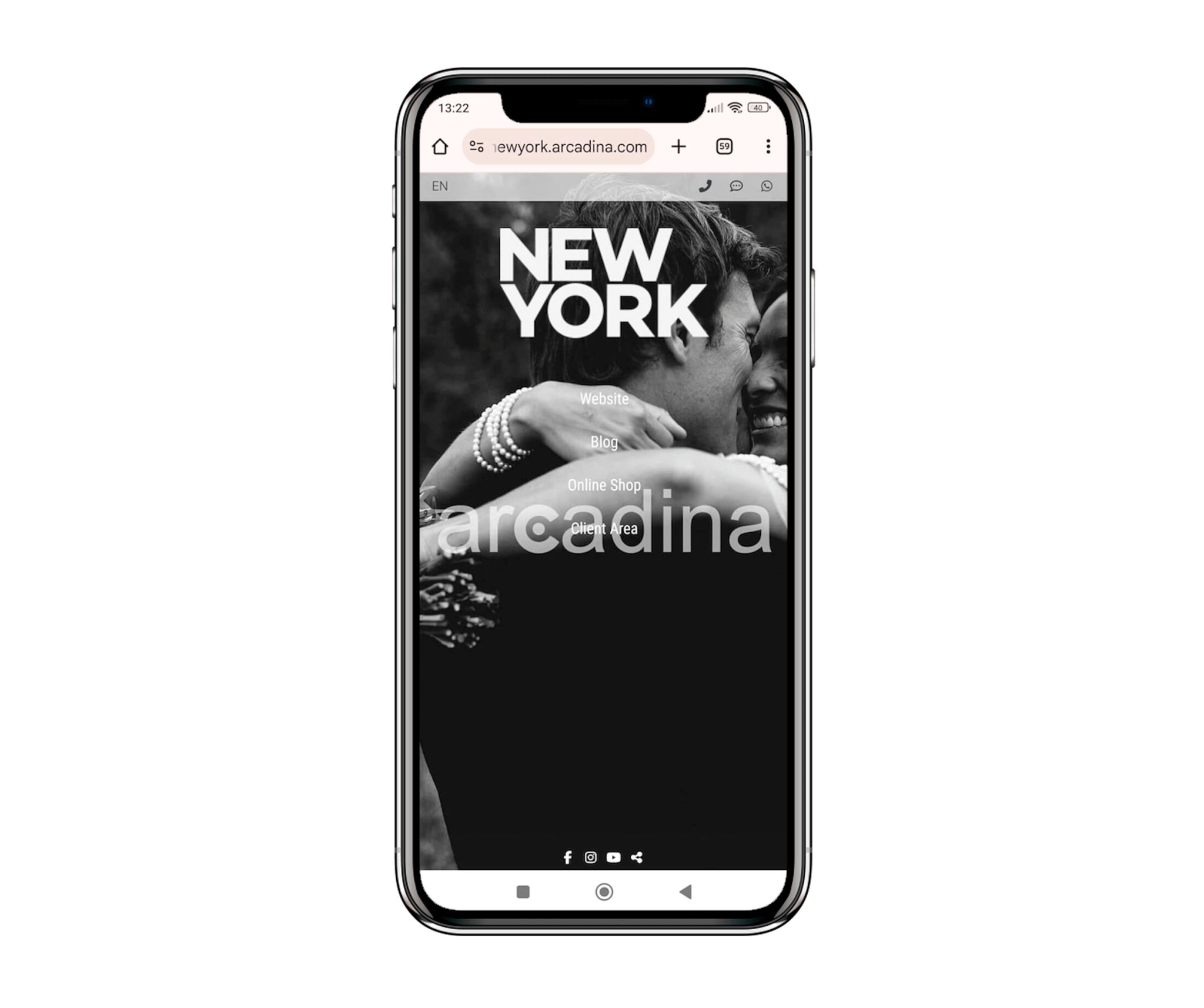
More and more users are accessing the internet from their mobile devices, whether during their leisure time, on their commute to work or in between tasks. Therefore, to improve the user experience (UX) of your photography website, it is essential that your photography website is optimised for mobile devices. This will ensure that visitors enjoy a smooth and pleasant experience on smaller screens, such as mobile phones and tablets.
To achieve this, it is essential that you have implemented, as is the case with Arcadina’s websites, a responsive design, which automatically adjusts to the size of the device’s screen. In this way, images and interactive elements will be displayed correctly, regardless of the device used by the user. In this way, your website will offer an optimal experience, improving visitor satisfaction and increasing the chances of them staying longer on your photography website.
Relationship between SEO and UX positioning

Improving the user experience will not only help you to show a better design of your website so that visitors end up happy and satisfied with their visit, but it will also allow you to improve the SEO of your website and vice versa.
Next we are going to see which are the points in which SEO can help to improve the user experience of your visitors.
- Content. One step to improve the user experience the people who visit your website is to offer them quality content that provides them with relevant information. Because quality information will make the user find all the answers they came to your photography website for, and above all, it is possible that if they have had a good experience, they will come back. Giving them valuable content, well written and taking into account your keywords, will be a perfect strategy to keep the customer on your page.
- Branding. It may seem irrelevant, but a photographer’s branding is also very important. Maintaining your brand voice and not sounding like a robot will increase the trust of your future clients, and is an aspect of the user experience. In addition to this, if you start to see that your users are complaining about some aspect of the website, don’t hesitate to change it! Don’t assume they “don’t know” and try to fix it as soon as possible.
- Conversion. If you do a good job, all the above steps should lead to a conversion, i.e. a sale. This happens when the user enters your website looking for something, finds it and decides to contact you. Nowadays there are many tools, such as Google Analytics that will allow you to measure this type of parameters.
Extra tips to improve the UX of your photography website

Here are some additional tips that will help you to optimise the UX of your photography website:
- On each page of your website, think of an objective focusing on what you want the user to do, for example, on the services page it could be to contact you, in the biography to present your work in a different way, in the online shop to buy photos or make a reservation etc.
- Find the right balance between your texts and your images. Create galleries that are specific to each type of work and when explaining services, don’t forget to include several photographs that are representative of each subject.
- Use the keywords and the main ideas that you want to convey on each page so that users can find you on the web and if you also highlight them on your website in bold or italics you will help users find the information much better.
- Your communications are part of your brand and as well as being consistent in all your communications, they also have to be appropriate to the type of customer you have.
- The more information you provide on your website, the more work you will get out of your way and the more satisfied your visitors will be when they come to your website looking for answers to their questions.
- Listen and respond to comments from your customers and users either through comments on the blog or on the feedback page, it is important to respond to all comments made to you through these means.
Improve the user experience on your photography website and turn visitors into customers
It is very important that you take care of the user experience on your photography website in order to gain the loyalty of users who find you on the Internet and to improve your positioning in search engines. If you are one of those who already have a photography website created with Arcadina, you will already be a long way down the road, since we have a series of fully customisable responsive templates, a professional blog adapted to the web design in which you can create specialised and relevant content, image galleries specially prepared for photographers to show off their latest sessions and many more business solutions for photographers.
And if you are one of those who have not yet tried what our websites look like on the inside, you can now do so for 14 days completely free of charge.
If you want to know more keys to improve the positioning of your website, in the following post you will find a series of tips that will be of great help.
>> 5 keys to improve the positioning of a photography website
To conclude this article on user experience, we are going to share with you the testimony of photographer Francisco Ruano.
>> Interview with Francisco Ruano, nature photographer
And finally, here’s our question: Before reading this article, were you already taking care of the user experience on your website? We’d love to hear from you in the comments.
Arcadina goes with you
Fulfil your dreams and develop your career with us. We offer you to try our web service free for 14 days. And with no commitment of permanence.
Arcadina is much more than a website, it is business solutions for photographers.
If you have any queries, our Customer Service Team is always ready to help you 24 hours a day, 7 days a week. We listen to you.

