New: customise galleries on the mobile version of your website
Sometimes images are published on the web and then in the mobile version of your website they do not look as you would like, so in Arcadina we have launched a new feature in which you can choose which images you want to appear in the galleries in the mobile version of your website.
Because your website, whether in desktop or mobile version, must always offer an impeccable user experience. That’s why we understand that some images, for example, in horizontal format that look great on a computer screen, on a mobile device can offer the user a worse experience by appearing smaller than desired. Now with the ability to customise the galleries in the mobile version, your visitors will not have to be uncomfortable seeing half-size images.
What are you waiting for to personalise the photos in the galleries of the mobile version of your website?
Contenido
- How can I customise the galleries in the mobile version?
- Adapt the galleries in the mobile version of your website and offer a better user experience to your customers
- Headache for your photography business? Take an Arcadina
- Private client galleries 🔒 to share your photos with password protection
- Solve all questions about the New Plans here
- Find out about Arcadina's new Business and Web plans
How can I customise the galleries in the mobile version?
To customise the galleries in the mobile version of your website from your management panel will be a very simple procedure, you just have to go to the gallery in question and choose the photo you want to unpublish from the mobile version. It’s as simple as that.
Please note that only the photos that are published in any gallery of your website (desktop) will be the images that you will be able to delete from your mobile galleries. This means that you will not be able to publish photos in the mobile version that have not been previously published in the desktop version of your website.
When it comes to unpublishing photos in the mobile version of your website, you will be able to do it in any gallery of your website, including the presentation page.
Let’s look at all the options available.
Mobile version of your website’s image galleries
On your website you will be able to create as many photo galleries as you need, so let’s take a look at one of them in the desktop version.
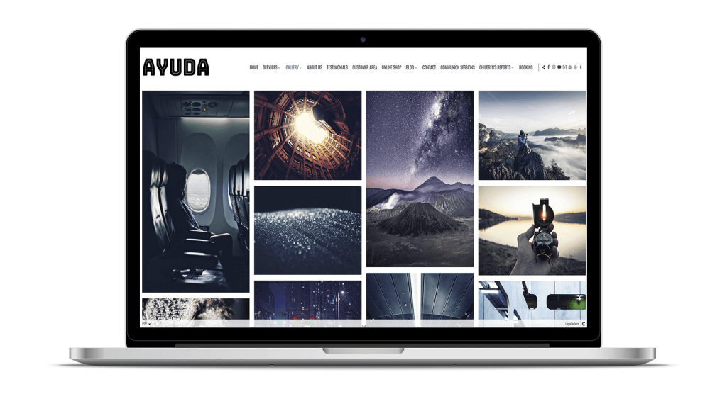
When a user accesses one of your image galleries from their PC and clicks on any of the photographs, they will be displayed in full screen and all of them will be displayed correctly, either horizontally or vertically.
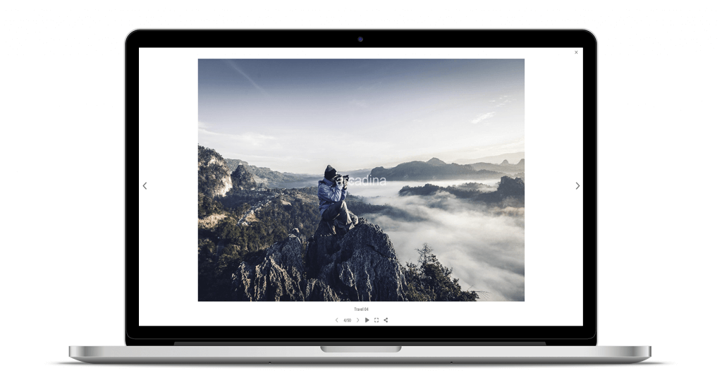
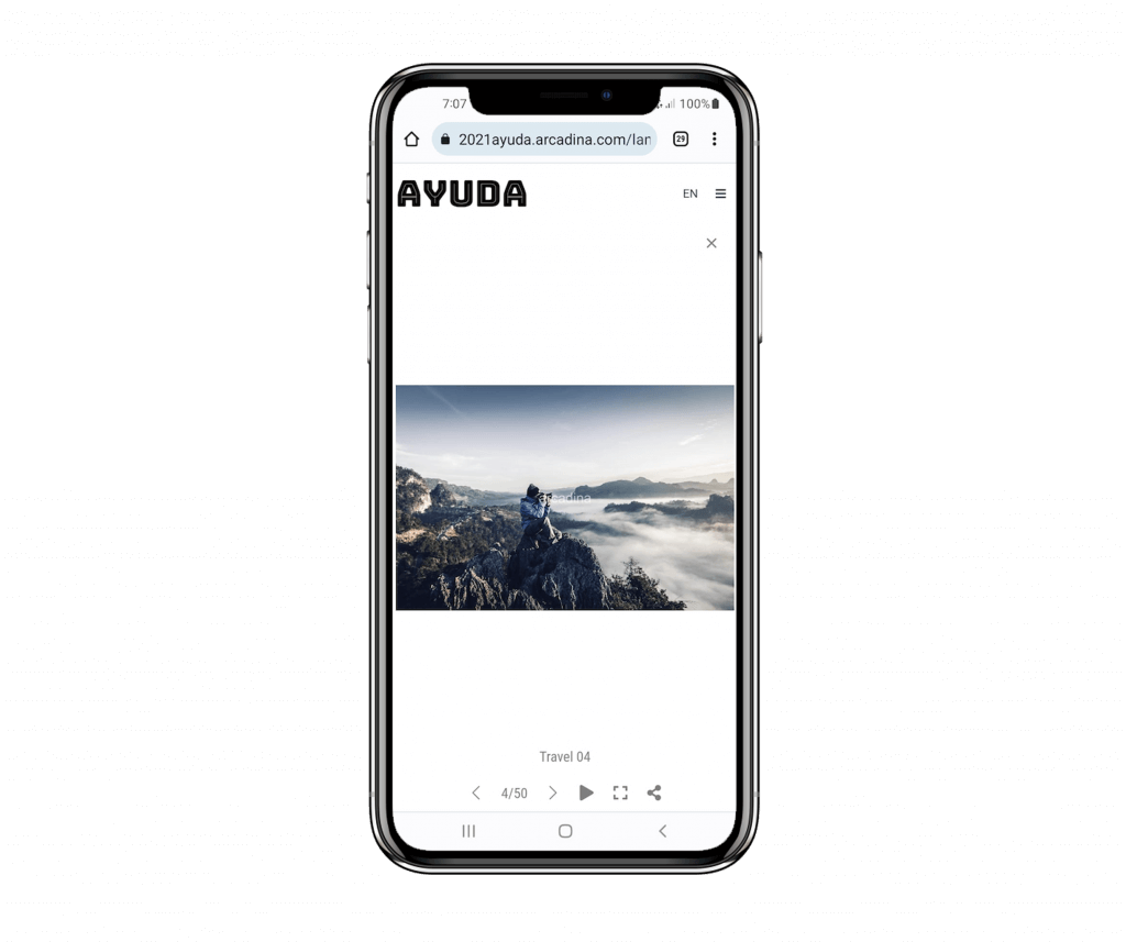
On the other hand, this type of horizontal format photographs in the mobile version, although they will still be seen in full, it is true that the details can be seen less because they are in landscape format.
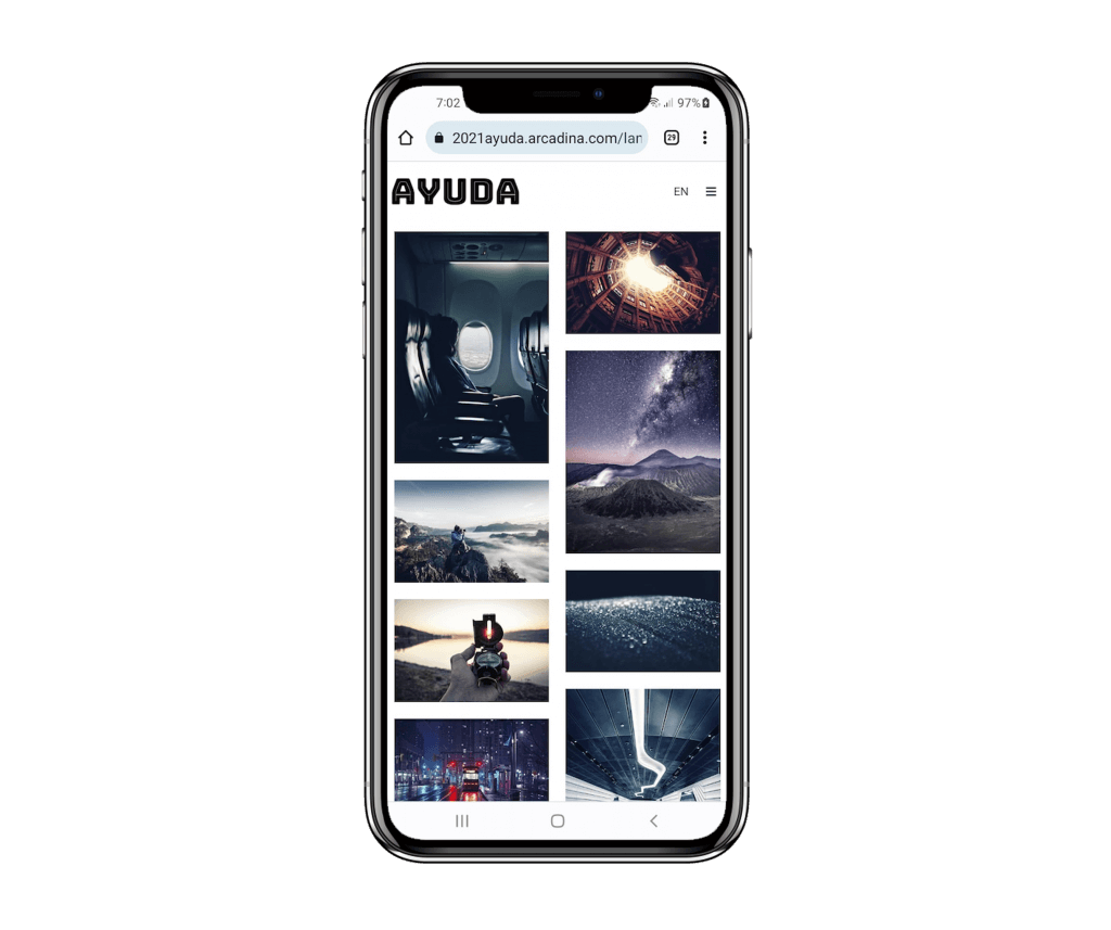
Let’s look at the same image of the desktop version.
To remove this image from the mobile version of your website, just go to: Management panel / sidebar / Web / Galleries, here click on the image gallery in question and locate the image you want to unpublish from the mobile version of your website.
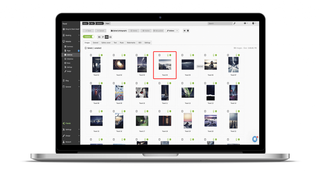
As you can see, in each photograph you will find 2 icons, one of a mobile device and the other of a circle. These are all the options that you will be able to configure:
- Published on mobile and desktop: the 2 icons in green.
- Published only on desktop: mobile icon in red and circle in green.
- Unpublished on mobile and desktop: mobile icon in red and circle in red.
Once you have unpublished the previous horizontal image in the mobile version, let’s look at the gallery again to check that this picture no longer appears (only in the mobile version).
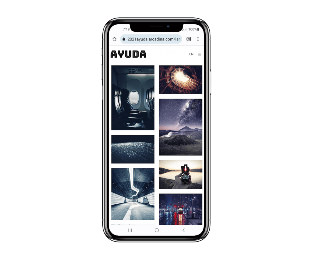
Pictures of your presentation page on the mobile version of your website
This same option to customise the galleries in the mobile version will also be available on the presentation page of your website, since on this page you will be able to choose between several designs where you can display a single image (slideshow), a video or a gallery of photographs (infinite).
In this last case of infinite design of your Presentation page is where you will also be able to decide whether certain images will be published in the mobile version or not. As in the previous case, if a photograph is not published in the PC version, it will not be displayed in the mobile version. As before, let’s see an example.
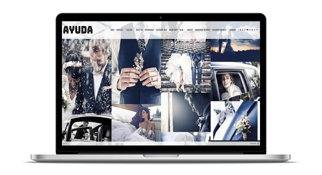
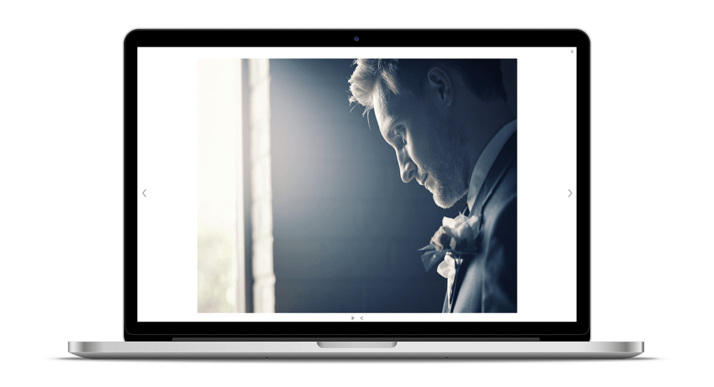
In this Home page, as in the rest of the galleries, any photograph will be shown in full screen by simply clicking on it, so that users will be able to appreciate all the details.
Now let’s go to the mobile version of this same Portada page.
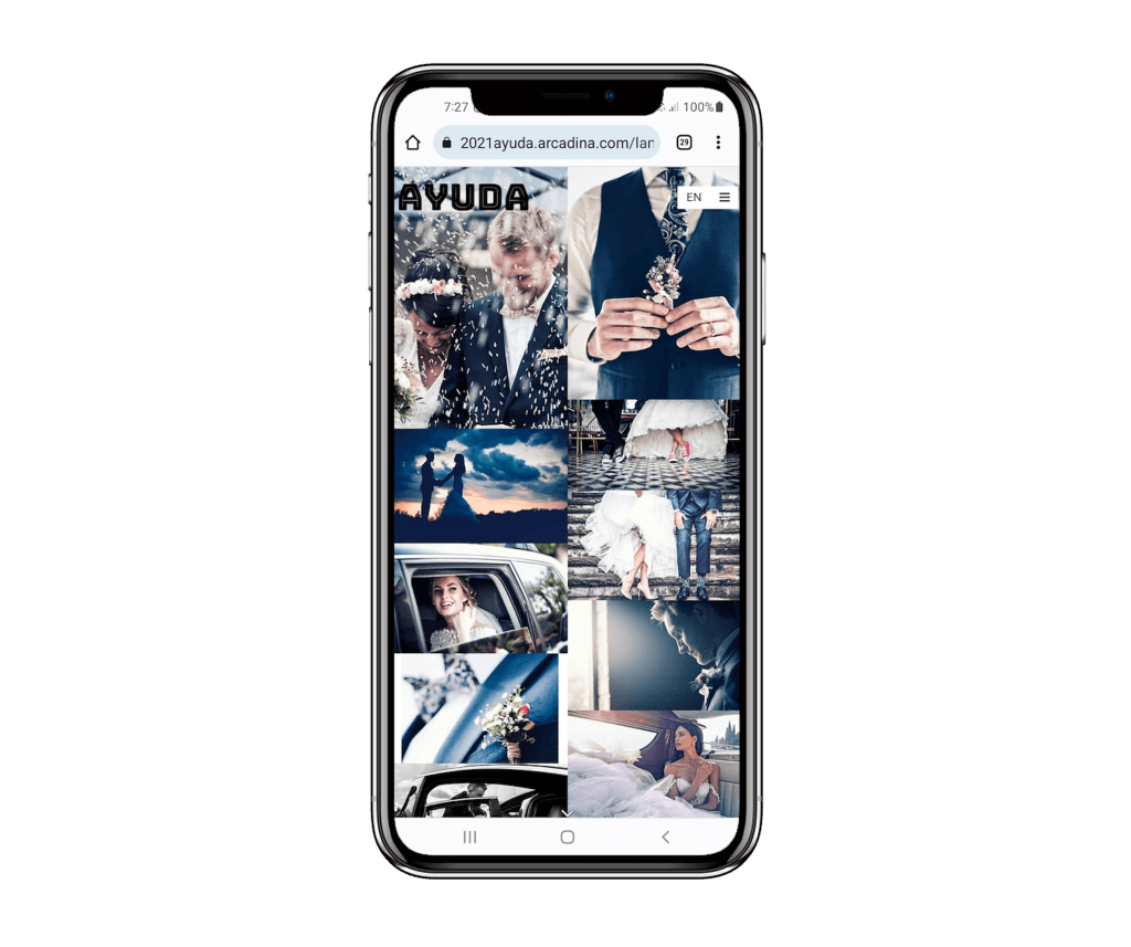
As with the web galleries, if a user clicks on any image they will be able to view it full size.
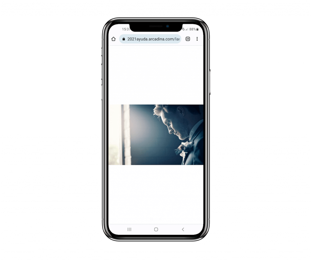
If in this version of your website, for example, you only want to display photographs in portrait format, go to: Management panel / sidebar / Web / Presentation.
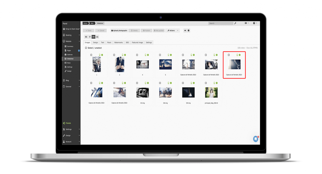
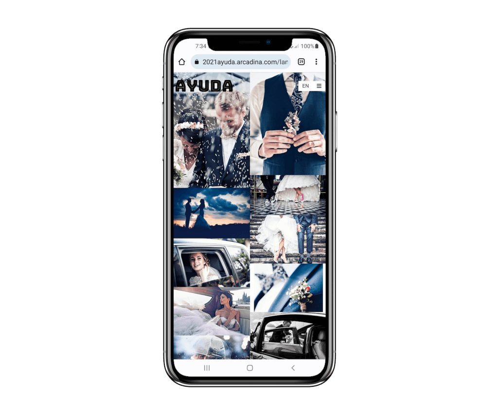
In the same way as before, if you want to unpublish this photo only from the mobile version, you only have to click on the green mobile icon to turn it red. And this is how the Presentation page would look like now.
In the following help article we explain this great new feature in much more detail.
>> Arcadina Help: Galleries in mobile version
Adapt the galleries in the mobile version of your website and offer a better user experience to your customers
At Arcadina we offer you a series of business solutions that will allow you to customise your digital business to your liking and now thanks to the option of customising the galleries in the mobile version of your website, you will be able to take this customisation a step further.
Thanks to all your suggestions, at Arcadina we always strive to launch some new feature or improvement that you yourselves have asked for practically every month of the year. And just this September, we have returned from the summer with a lot of energy and in addition to this improvement we have launched a few more, such as: being able to share with your customers information from your website in a QR code, the ability to enlarge the images in a tactile way in the business section and many other improvements that you can find in our News section of the help.
>> Consult here all the Arcadina News for 2023
Today we are going to share with you the interview of Juan Carlos Albuera from Albuera Morales Fotografía.
>> Interview with Juan Carlos Albuera
And to finish this article we would like to know what you think about being able to choose the photos of your galleries in the mobile version of your website. We would love to read your opinions in the comments.
Headache for your photography business? Take an Arcadina
Headache for your photography business? Take an Arcadina
Fulfil your dream of becoming a professional photographer with the help of our business solutions. Now you can create a website and business for free for 14 days with no commitment of permanence.
Thanks to Arcadina’s business solutions for photographers, your business headaches will disappear.
If you have any queries, our Customer Service Team is always ready to help you 24 hours a day, 7 days a week. We listen to you.

