Unique designs for your photography website
The photography web design you choose for your photography website is very important because this choice will be part of your brand identity and will help your visitors to get a good impression of you.
That’s why at Arcadina we have at your disposal web designs, fully customisable and adaptable to your business so that you can create a unique photography website in your own style.
Each web design can be easily adjusted to your own personal brand, this will help you to reinforce your branding and make the process of making a fully customised photographer’s website easier.
“Choose the photography web design that best suits your business and create a stylish and bold photography website. You have various available.”
Contenido
- How to create a photography website?
- Choosing a design to create a photography website has never had so many options
- 1. Photography website with Bangkok design: for daring photographers
- 2. Creating a photography website with Tokyo design: for minimalist photographers
- 3. Making a photographer’s website with Arizona design: for more imaginative photographers
- 4. Photography website with New York design: for a photography business that makes an impression
- Public and private galleries are always available on your photography website
- Create a photography website to suit your style with any of the designs available
- Arcadina goes with you
- 6 advantages of having your own online photography business with Arcadina
- New products Passepartout and Desk Block: your photos in methacrylate
- The WhatsApp Business service is now available in Arcadina
How to create a photography website?
Creating a photography website with us is very easy. All you have to do is sign up (free for 14 days) and try for yourself how you can create a photography website with a built-in business in a very short time and without the need for computer skills.
When it comes to making a website for photographers, you can help yourself with the video tutorials on our YouTube channel and our help section.
And whenever you have a doubt or query that you can’t solve, you can contact us through the following link. We will be available 24/7 to answer your questions so that you can make a unique website for photographers.
Choosing a design to create a photography website has never had so many options
When choosing the design of your photography website with us you have the possibility to choose between web designs specially designed so that you can make a unique website for photographers. Here are the designs:
- Bangkok. Avant-garde and with cascading photographs.
- Tokyo. Minimalist and with full screen images.
- Arizona. Creative and where everything stands out, including content.
- New York. Shocking and attractive at the same time.
Did you know that all the design changes you need are included in your web plan? This way, you will be able to give it a “new look” as many times as you want if you want to make a unique website for photographers.
>> Find out about Arcadina’s new Business and Web plans
When creating a photography website, you can also modify whenever you want the design of: galleries, homepage, presentation page, the appearance of the blog and customise fonts and colours. As soon as you browse through the management panel of your website, you will discover all these possibilities and many more.
>> First steps with Arcadina: A must-have guide for photographers
1. Photography website with Bangkok design: for daring photographers
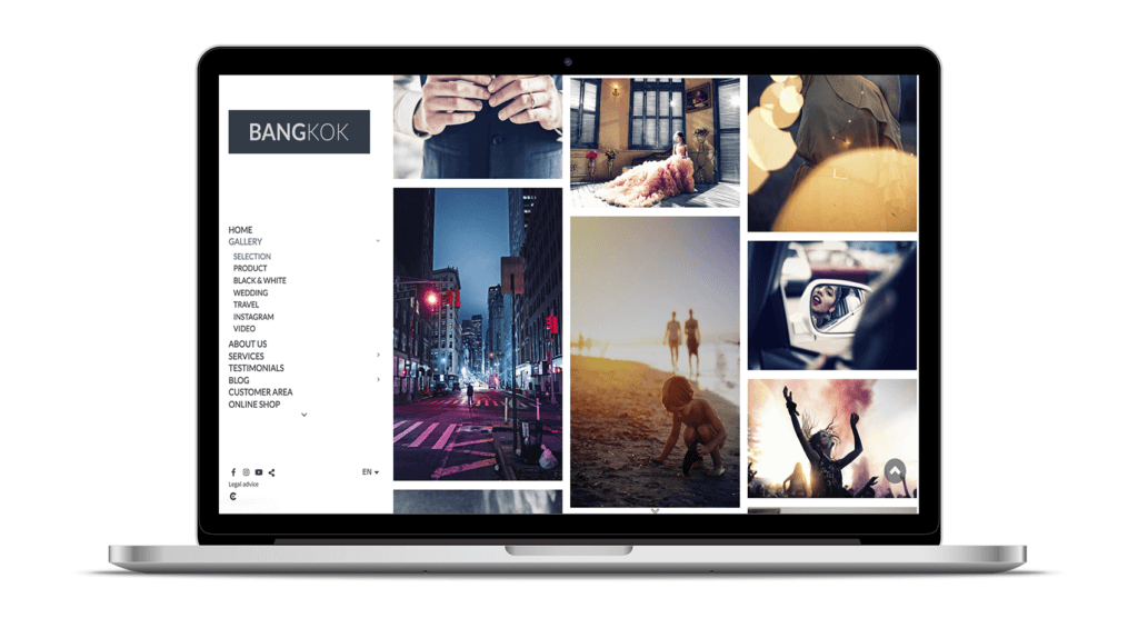
The web design of Bangkok Photography is characterised by a modern and practical structure.
- Main menu. It is located on the left side of the screen, so that visitors will be able to clearly see, from the very first moment, the information available on your photography website.
- Logo. It appears at the top left of the screen. A strategic place for your visitors to know who you are at all times.
>> How to create the perfect logo for a photographer?
“Bangkok Photography’s cutting-edge web design is full of features to suit your needs as a photographer or videographer. Its cascading photo and video galleries will enhance your work, giving it a special shine. It suits any type of photography to win over your clients and followers.”
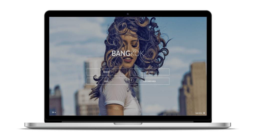
Cover of the Bangkok design
In the Bangkok design homepage, you can include all the shortcuts that you find interesting to highlight and, like any other element in Arcadina, you can customise it completely.
Bangkok Design Gallery
The photo and video galleries of the Bangkok design allow you to display your images in full screen and up to 2000px in size (this feature is common in all our web designs). You can also create as many galleries and sub-galleries as you need, choosing between Infinite, Carousel, Pages or Slideshow layouts.
By the way, do you want to know the advantages of each of these gallery designs when creating a unique photography website? Below, we have left you an article where you will be able to solve all your questions.
>> Discover the photo and video galleries Pages, Slideshow, Infinite and Carousel
Bangkok Design Blog
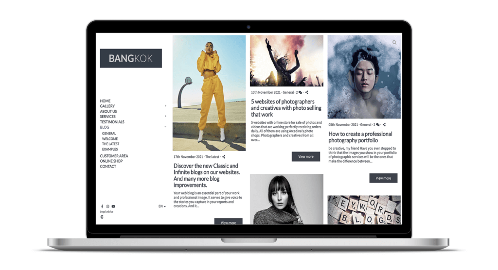
At Arcadina we give a lot of importance to images, but we do not neglect the written part either, because we are very aware that texts are essential for a photography website to be effective and also to be properly positioned in search engines.
In this case, we have chosen to show the articles of the blog with an Infinite design, very easy to navigate. In your blog you also have the possibility of creating categories to order the different publications that you create, depending on the subject to be treated.
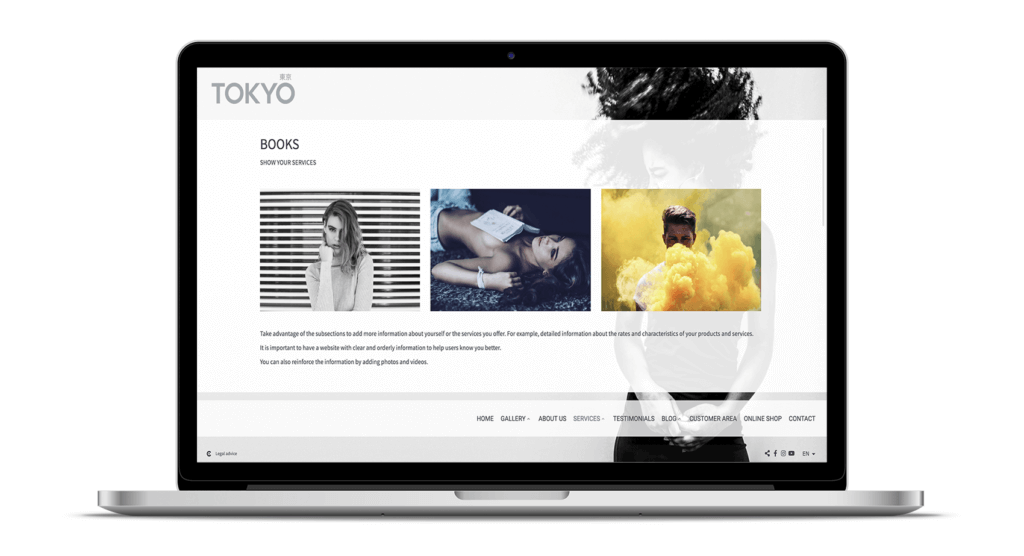
2. Creating a photography website with Tokyo design: for minimalist photographers
If you want to create a photography website with personality, Tokyo web design will surprise your clients and followers with unexpected and groundbreaking lines.
- Main menu. It is located at the bottom of the screen and floating above the images. A somewhat unusual location that will give your photography website a more striking point.
- Logo. It is located at the top left-hand side of the screen.
“Tokyo is a groundbreaking design that offers you an explosive mix of full screen images, minimalist design and smooth transitions. Its different colour versions and choice of backgrounds will allow you to change the look of your photography website very quickly. If you want to make a photographer’s website that makes an impact with a different design, Tokyo is your best ally”.
Web presentation of the Tokyo design
When creating a photography website, the presentation page will be the first impression that your visitors will have of your work and that is why, in the Tokyo design, the first thing they will see will be a slide show of photographs or a large video.
In addition, to give your images greater visibility, you will see that the main menu is located on a semi-transparent strip that will not cover any detail of the main photograph.
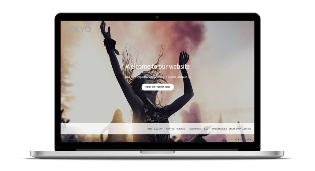
Photo gallery and videos of the Tokyo design
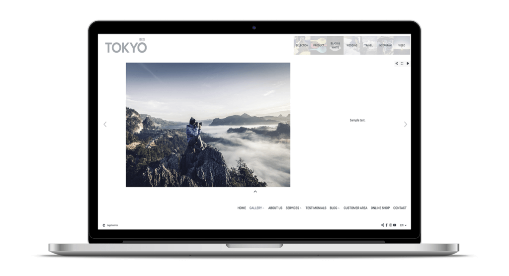
A differentiating point when creating a photography website with this design is that the galleries and sub-galleries will appear at the top of the screen (if you find it interesting, you can also add a representative image for each one). It is an accordion menu, flexible, that expands and shrinks when you move the mouse pointer over it, achieving a very original and eye-catching effect.
Did you know that when making a photographer’s website adapted to your style, in any of the available designs you will be able to add photo galleries or videos and also integrate Instagram accounts?
Tokyo Design Services section
When explaining how you work in your photography business, it is important that you give as much information as possible in a very clear and visual way. That’s why, in the services section of the Tokyo design, you have a space (full screen) to explain your photography reports in detail. Thanks to the content editor, including clear and direct texts, photos and videos to enhance your message will be very easy.
>> The importance of text on a photography website
3. Making a photographer’s website with Arizona design: for more imaginative photographers
If you want to make a website for photographers that goes straight to the heart of your visitors, we encourage you to try the Arizona model, we are sure it will become your ideal candidate.
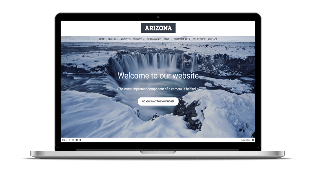
- Main menu. It is located in the centre of the upper part of the screen, reminiscent of the more traditional menus.
- Logo. In this web design it is placed in a more eye-catching location, right at the top centre of the screen.
“Impress your visitors with a creative and heartfelt design. Arizona is ready for them to enjoy your work in a big way. Its galleries adapt to the size of your mind – a design that makes one want to stay and live on this photography website!”
Web presentation of the Arizona design
On this page the stars will be your logo and your images, 2 of the most important elements when making the first presentations. In this part of your photography website, you can include a slideshow (or Infinite) to show your most representative photographs.
Another element that you can add when creating a photography website is a commercial text, this way you will be able to attract the attention of your readers more easily.
>> New: Add commercial text to your web presentation
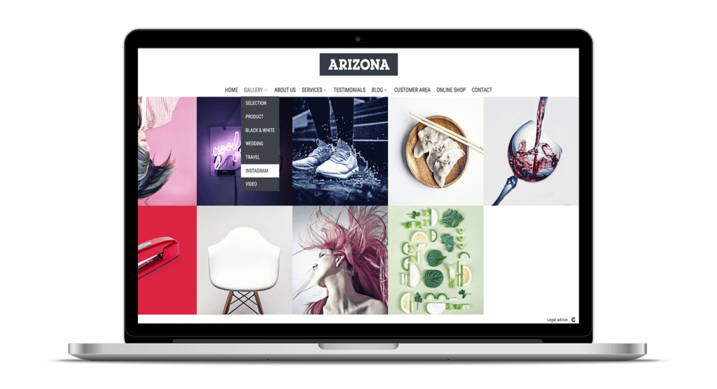
Arizona Design Gallery
This is the space where you can show your visitors all your talent in an orderly and very visual way. In the Arizona design Carousel gallery, you can create all the galleries and sub-galleries you need to organise each session in its corresponding space.
In addition, you can also include a direct access section to Instagram, so that your photos “fly” through the network.
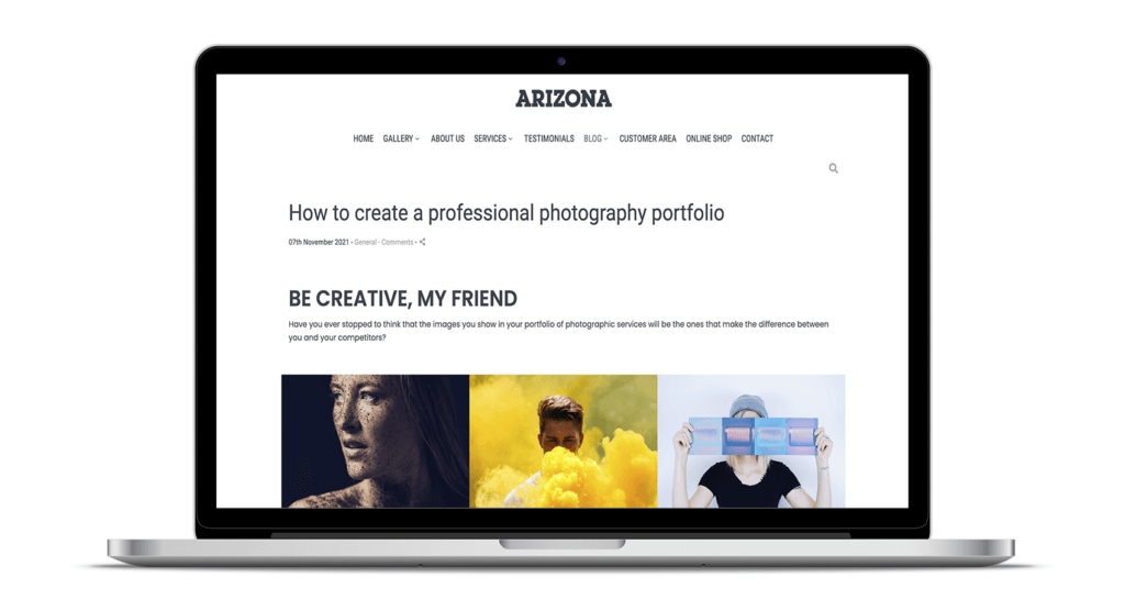
Arizona Design Blog
In your photography blog, as well as being able to include a category to organise your articles according to the subject matter, within each post, you can add full-size photographs (with an integrated image viewer up to 2000 pixels), videos and give the option to share them on your social networks.
“All our blogs include an integrated gallery with a full-screen image viewer up to 2000 pixels. A feature that makes all the difference.
4. Photography website with New York design: for a photography business that makes an impression
If you are looking for a stunning photography website with an eye-catching design, New York is undoubtedly the design for you.
- Main menu. It is placed in the upper central part to leave more space and prominence to the images.
- Logo. Your brand will be integrated with the photographs on the top left.
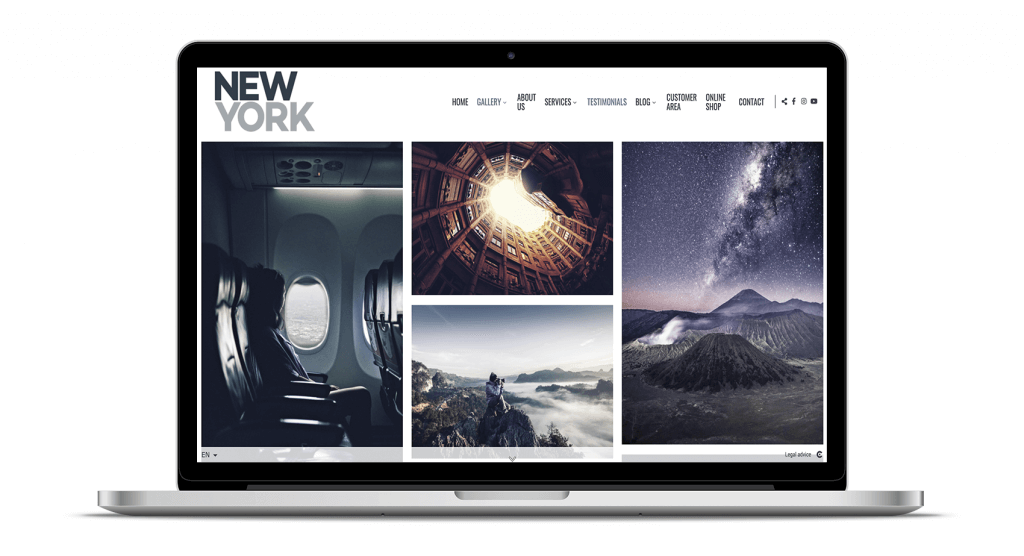
“In the New York design your images take centre stage. New York is suitable for any photographer who wants to show their work in an attractive and impressive way. Ideal for weddings, advertising or landscapes, where large size photography is becoming a trend”.
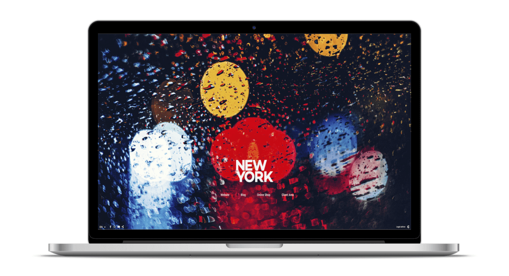
Cover design New York
The shortcut buttons are given less prominence on this front page to give more weight to the header photo and logo of your photography website design.
To ensure that not a single detail of the main image is lost, a semi-transparent strip will appear to highlight the buttons when the cursor is moved closer to the button area.
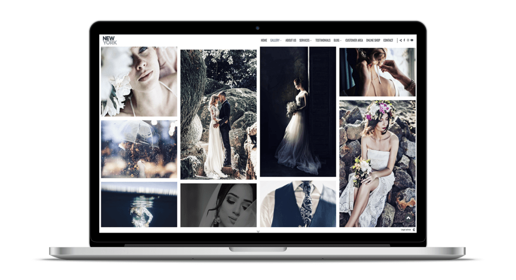
Design Gallery New York
If you find it necessary to include a submenu in your image gallery, you can also customise the appearance of this element of your photography website. In this case, in the New York design we have chosen to include a Dropdown menu. And for the mobile version, you will also be able to customise the menu.
>> New: new web menus Dropdown desktop and Cool mobile
In addition, you will be able to share each image on your social networks immediately.
On our websites you will always be able to share all the content on social networks: photos, videos, a text section, a blog post, a sales gallery, or any other information you display on your photography website.
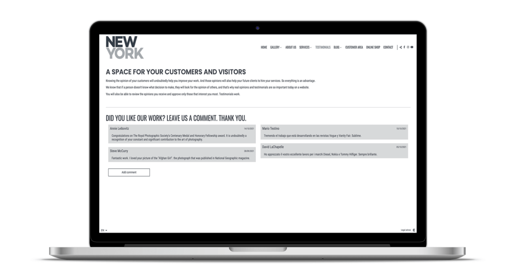
Opinions on the New York design
Creating a photography website where you give space to testimonials is essential. People who don’t know you and visit your photography website for the first time will need some reassurance that you are a great professional. Also, inviting your clients to leave their opinion on your website can be decisive for other clients when deciding which photographer to hire.
Public and private galleries are always available on your photography website
Providing a premium service to your clients on your photography website is essential to keep them satisfied and to make them speak highly of you as a professional photographer.
Therefore, when creating a photography website, if you include different ways to earn money, such as: private online photo selection, sale of images in print or digital download products, private photo and video presentation galleries, and more options that you will have at your fingertips, your profits will grow and you will be much happier.
For this reason all our customers who enjoy any of the Business plans can include public galleries to offer the sale of photos, videos, services and products. And for customers who have contracted a Web plan, they will be able to offer their customers a series of private galleries so that they can view a sample of photographs, select, purchase, download or print in professional products their images.
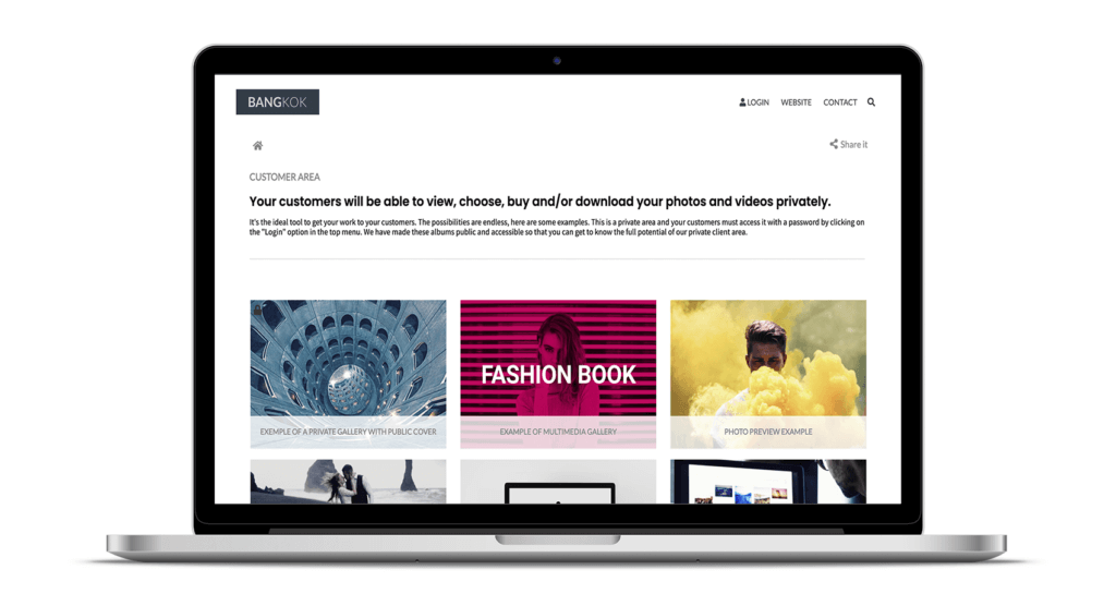
demobangkok.arcadina.com/en/customer-area
These two business tools will be essential when it comes to directly selling your images, videos, products or photography services and will become essential when creating private galleries for the selection or downloading of photos.
In addition, you will also be able to create several separate online shops on your photography website if you need to differentiate, for example, the sale of sports photography from the sale of your photographic services and products.
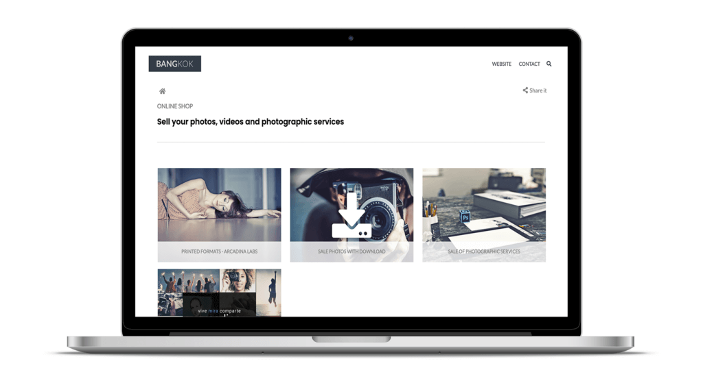
demobangkok.arcadina.com/en/online-shop
Want to know more about the advantages of including public and private galleries in your photography business? Here are a couple of very interesting articles.
>> How to sell photos online without paying commissions
>> 10+1 questions that photographers ask about Arcadina Labs
Create a photography website to suit your style with any of the designs available
Now you know, create a photography website that helps you to create your own brand identity thanks to a design that is true to your style and that has all the information your potential clients need to know about you.
If you want to discover a series of real examples of each of our exclusive web designs for photographers, visit our examples section available on the Arcadina website.
Many of your colleagues (and competitors) have already started to design a photography website with Arcadina, as is the case of Javier Bejarano. What are you waiting for to make a unique website for a photographer?
I want to start now with Arcadina
>> Javier Bejarano talks to us
Before we say goodbye, we want to remind you of some great news: did you know that you can now get free months if you refer a friend to set up their own photography website? We’d love to read what you think of this new proposal in the comments.
>> Do you want to get free months? Use Arcadina’s referral system
Arcadina goes with you
Creativity goes with you, offering you the best service goes with us
Fulfil your dreams and develop your professional career with us. We offer you to create a photography website for free for 14 days so that you can try our platform without any commitment of permanence.
Arcadina is much more than a website, it is business solutions for photographers.
If you have any queries, our Customer Service Team is always ready to help you 24 hours a day, 7 days a week. We listen to you.

