12 standout communion photographer websites (and why)
Communion photographer websites that really stand out tend to share a very clear pattern: they don’t leave their website “on autopilot,” but rather review, improve, and update their content before each season. If you want to sell more communion sessions, your website must address families’ typical questions from the very first click: explain your communion photography services in detail, show a recent portfolio (with a variety of styles and locations) and provide quick contact details. And if you also incorporate a simple booking system, families will be able to schedule their communion photoshoot from the comfort of their own home, without any phone calls or waiting around. The “extra” that makes the difference comes later: delivering communion photos with a professional online gallery (with options to select, download or purchase, depending on your model) improves the experience and raises the perception of your brand.
It has been proven that professionals who do not take care of their digital presence tend to have more difficulty achieving their sales targets. This is even more noticeable in communions: with today’s pace of life, most families search for and compare photographers online, and decide based on what they see on the website (quality of work, clarity of the offer and ease of taking the next step). That’s why, in this post, we’ve put together 12 websites of communion photographers that stand out (and we explain why), with specific ideas so you can see what they’re doing right and apply it to your own website for the 2026 season. What’s more, they all rely on Arcadina’s business solutions to improve their visibility and take their communion photography one step further.
Be inspired by the strategies used by the websites of leading communion photographers to attract more families, convert visits into bookings and sell more sessions.
What do the most successful communion photographer websites have in common?
The communion photographer websites that generate the most bookings tend to share something very specific: they not only show beautiful photos, but also guide the family from their first visit to the booking, with a clear, quick and frictionless journey. If you want your communion photography website to really work, check out these points:
- Clear, decision-oriented information. Explain your proposal and the entire communion photography process on your photography website: how to choose the date and location, duration, how to prepare, delivery times and what each option includes. Transparency reduces doubts and increases confidence.
- An up-to-date and well-structured communion portfolio. Your best communion photos should be in galleries that are easy to browse (by style, outdoor/studio, siblings, etc.). Better to have 20 powerful images than 80 repetitive ones.
- Visible calls to action. Clear buttons such as “Check availability”, “Book a session” or “Request information” at key points, without forcing the customer to search for contact details.
- Hassle-free online booking. Short form, simple steps and an online booking calendar. Every extra click can mean one less booking.
- Professional delivery and sales opportunities. After the session, an online gallery where they can select, download or purchase (copies, albums, reminders) enhances the experience and increases the average ticket.
- Speed and mobile first. Most people compare from their mobile: if it takes too long to load or looks bad, they leave.
- An extra that makes a difference: FAQ + social proof. Address typical objections (clothing, rain, siblings, permissions) and add real reviews near the booking section.
Advertising that you do communion sessions is not enough: families need to see how you work, what kind of impression you give and how easy it is to hire you. An optimised website converts visits into bookings; a confusing website gives them away to the competition.
What these communion photographer websites have in common (and how to apply it)
On these communion photographer websites that we are going to highlight today, we will see that a series of very clear patterns are repeated. Use them as a quick checklist to review your website before the season and apply improvements that will be noticeable in bookings and conversions:
✅ Immediate message on the home page: make it clear in 3–5 seconds that you do communion photography, where you work, and how to contact you.
✅ Specific page for communions: create a “Communions” section with your proposal, style, and process for communion photography (without forcing visitors to search for it in the menu).
✅ Well-explained services: detail what each option includes (duration, location, delivery, extras). The fewer questions, the easier it is to hire you.
✅ Updated and filtered portfolio: show your best recent communion photos, sorted by style or location, and avoid endless galleries.
✅ Visible social proof: add real reviews and, if possible, a phrase such as “families served” or “years of experience” to reinforce trust.
✅ Clear calls to action: visible buttons such as “Book a session”, “Check availability” or “Request information”, repeated throughout the page.
✅ Easy booking: make it easy for families to book from home (short form, calendar or clear steps).
✅ Professional delivery: after the session, use an online gallery where they can select, download or purchase, depending on how you work.
✅ Speed and mobile: check that it loads quickly and looks perfect on smartphones (most searches come from there).
✅ Basic SEO in order: title, text and URL consistent with “Communion photographer websites”, as well as images with descriptive names.
If you tick 7–8 of these boxes, your website will be much closer to truly “standing out”.
12 communion photographer websites that make a difference
To show you how some of the best-performing communion photographer websites are designed and structured today, we’ve put together a compilation of 12 sites that are worth exploring at your leisure. Beyond aesthetics, what’s interesting is why each one manages to attract families and take them from inspiration to booking: clear messages, portfolios that build trust, visible calls to action, and a simple flow for contacting or requesting availability.
In each example, we include specific recommendations designed to boost your results for the 2026 communion season: from how to present your communion photography offer so that it is understood at first glance, to small conversion adjustments (structure, texts, bookings, online delivery) that can make a big difference. You will see that many improvements do not depend on ‘doing more’, but on making it easier: fewer doubts, fewer steps and more clarity.
Before diving into the list, we recommend reading this article with practical ideas for improving your communion photos this year. It will help you strengthen your portfolio and, combined with the tips from these websites, create an unbeatable combination: good work + a website designed to convert visits into communion sessions.
>> Communion photographs 2026: 9 keys to planning your campaign and achieving the best images
1# Nacho Valverde: Segovia
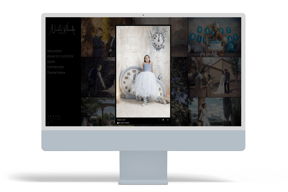
We open this list of communion photographer websites with the website of Nacho Valverde, a photographer in Segovia who specialises in photography and video for families, as well as weddings and other sessions. His website has a very clear structure for the user: it organises his work into galleries (including a specific section for Communion and another for Communion Ceremonies), incorporates a Customer Area for delivering reports privately, and has an Online Shop, which reinforces the professional approach from start to finish.
An interesting detail of his approach is that the navigation allows quick access to what many families are looking for: to see real examples before contacting him. In addition, as we recommend in this article, Nacho has added an ad on the home page to highlight his seasonal communion sessions, a simple action that can greatly improve the visibility of the campaign as soon as you land on the home page.
As an improvement to further increase conversion, it would be a good idea to create a specific service page (landing page type) focused on his communion photography: explain the process step by step, what each package includes, delivery times and answer common questions (clothing, locations, rain, siblings, etc.). This not only helps more families take the step of contacting you, but also provides “indexable” content that Google tends to reward over pages that only show images.
2# May Fotógrafa: Malaga
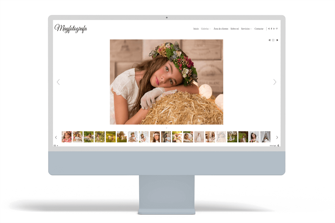
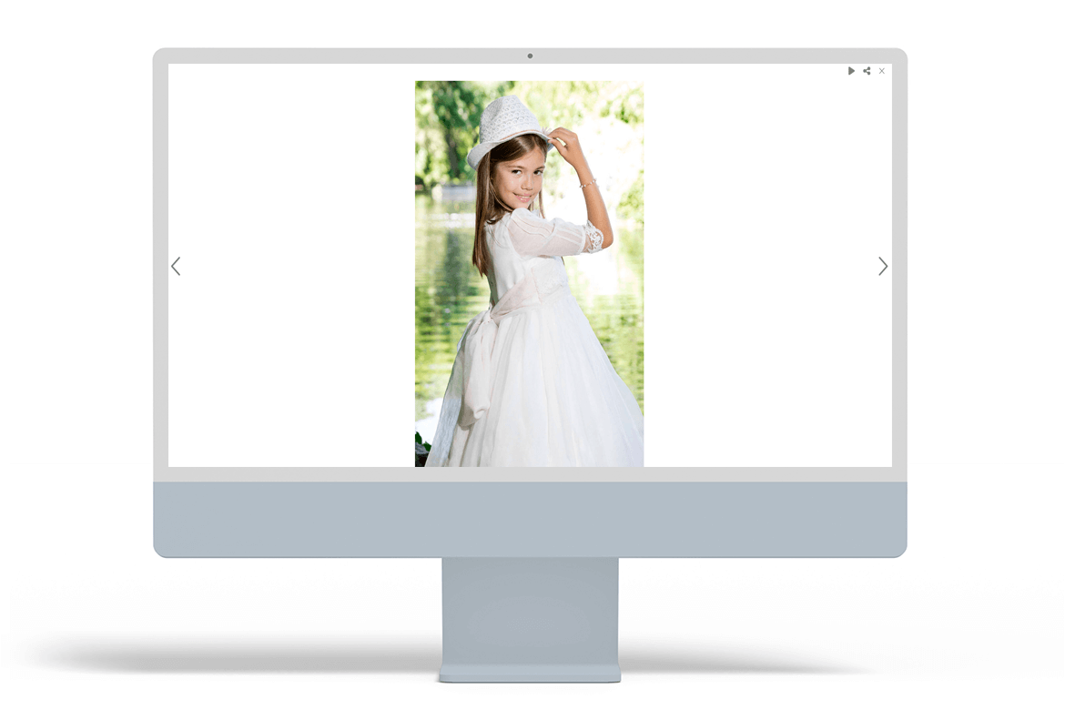
We continue with May, a photographer in Malaga who combines communion photography with children’s, newborn and wedding shoots. Her website is a good example of a “visual” structure for this type of service: she has created separate galleries by category (Wedding, Communion, Newborn, Children, etc.), making it easy for families to quickly find real examples of communion photos and get an idea of her style. It also includes a client area for private delivery of reports, which is a valuable feature for improving the post-session experience and reinforcing the perception of professionalism.
An interesting detail is that the website is available in several languages, which can be helpful if you work with international families or areas with tourism/foreign residents.
As an improvement to increase bookings, it would be ideal to complement the galleries with a specific page for communion services. Right now, the “Services” section is very brief and general; if you expanded the communion sessions section with practical information (what the report is like, options/packages, deadlines, what is included, how to prepare for the session, frequently asked questions), it would reduce doubts and improve both conversion and SEO.
And in the Customer Area, a good tactic is to enable a public cover page on some private galleries: this allows you to show a “sample” without revealing the entire report, conveying volume of work and confidence without compromising privacy. To round off the flow, your contact form already includes “Communion” as an event type, which is perfect; all that’s missing is to take people from the gallery to that action with visible buttons (“Check availability” / “Book”).
3# Sí Quiero Studio: Madrid
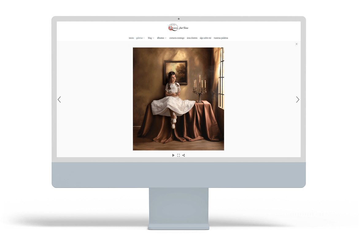
Although the name might suggest that José is 100% focused on weddings, his website is a good example of a well-designed First Communion photography site for the season: within “Galleries” he has a specific section for First Communion, even separating studio communions and outdoor communions, which really helps families quickly find the style they are looking for.
In addition, it reinforces trust with several elements that often make a difference in communion photography: it has a section called “Your words” (testimonials), a space called “Something about me” to humanise the brand, and a customer area for private delivery of the report. Another powerful point: it has a blog with a First Communion category, ideal for capturing informational searches and driving that traffic towards conversions.
And if the goal is to increase conversions, the contact form also allows you to choose “Communion” as the type of event (filtering leads and reducing friction).
As a clear improvement to sell more communion sessions, it would help to incorporate a booking calendar (with day/time selection) and, if it fits your model, online deposit payment. That step turns “likes” into action and avoids losses due to late responses. Another quick improvement: a specific page for communions with packages, process, deadlines and FAQs, linked from the galleries and the blog, to close the circle of “see → trust → book”.
4# Mónica Udina: Barcelona
Mònica Udina is a good example of a communion photographer’s website designed to convey trust at first glance. Although she specialises in children’s and family photography, her website has a specific Communion section where she clearly states her approach and what she offers: communion sessions in her studio in Vilafranca del Penedès or outdoors in well-known locations in her area (vineyards, woods or beaches), which helps families to quickly imagine their own photo shoot.
In terms of content, the website is well organised by category (newborn, pregnancy, babies, children, family, communion, etc.), and the ‘About me’ section adds a sense of closeness and authority: it explains his career and reinforces the human factor that many families look for before making a decision.
As an improvement to further increase bookings (and positioning), it would be great to turn her communion section into a more comprehensive service page: detailing the step-by-step process of the communion report (duration, locations, what is included, delivery times), adding a mini FAQ with common questions (clothing, siblings, rain, permissions) and reinforcing the CTAs with visible buttons such as “Check availability” or “Book”. This reduces friction, improves conversion and gives Google more relevant “textual” context for searches related to communion photography.
5# Uglietta: Alicante
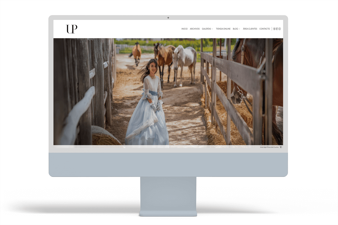
Uglietta (Alicante) is a good example of a communion photography website with a highly visual approach: from the first glance, the main navigation makes it clear what they do (Weddings, Couples and Families, Black and White, Communions, Children, etc.), making it easy for a family to quickly find the section they are interested in without getting lost.
For communions, the strong point is precisely this direct access to the Communions category from the menu, which is key when users are comparing photographers and want to see communion photos as soon as possible.
In addition, the website incorporates two very business-oriented features:
- Online shop.
- Customer area, ideal for delivering reports privately and maintaining an orderly experience with families.
And as an interesting extra for SEO, the blog has specific categories (including “Communion”), which allows you to work on content that attracts organic traffic during the season and directs it towards hiring.
Recommendation to further boost communion sessions: create a short “Communion Photography” page linked from the menu or gallery, with the process, what it includes, deadlines, FAQs and a clear CTA to contact or to the direct booking option through a Reservations section. This reduces doubts and improves conversions.
6# Alberto Valencia: Bilbao
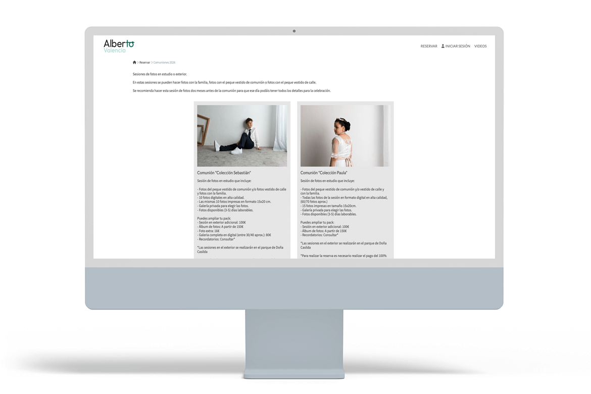
Alberto Valencia is a good example of communion photographer websites that are committed to direct conversion: his site is focused on online booking/hiring and he has already created a specific campaign page, “Communion 2026”, where the session is presented as studio or outdoor photos, with the option of taking communion photos with the family and with the child dressed for communion.
In addition, the purchase flow mentions a payment gateway (e.g. PayPal notification), which fits in with a deposit/reservation strategy to secure bookings during the season.
Extra recommendations to sell more communion sessions:
- Add an information page before “Book”: a communion photography page with portfolio, style, process, what each package includes, deadlines and FAQ. A services page reduces doubts and improves conversion (and SEO).
- Clearer packages + session bookings: “Mini / Standard / Premium”, indicating number of photos, album, copies, location (studio/outdoor) and times.
- Social proof next to the CTA: reviews and 2–3 “micro-benefits” (online delivery, easy selection, speed, etc.).
- Extra services: after booking, offer albums, reminders, enlargements and extras (family/siblings) as add-ons.
7# Miguel Ángel Fotógrafos: Almería
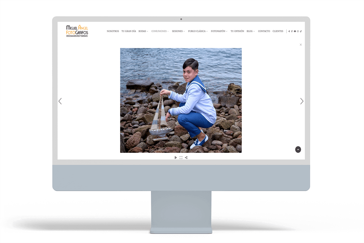
Miguel Ángel Fotógrafos (Almería) is a good example of a communion photographer’s website with a “catalogue + sales” approach: in addition to working with weddings, pregnancy, newborns, children, Christmas, families and photo booths, their website allows you to quickly understand their style thanks to a clear menu and specific content. It is worth noting that it has a blog with a Communion category, where it publishes complete reports (for example, outdoor sessions in Cabo de Gata), something that greatly helps families to visualise what a real communion report is like and also provides quality SEO content.
In terms of service, it also scores points for having sections dedicated to studio communions and outdoor communions, because it reduces friction in the decision-making process: the customer does not have to guess at options, they can see them.
And, for the post-session part, the Customer Area allows you to deliver the work privately, maintaining an orderly and professional experience.
Key recommendation for selling more communion sessions: convert that visual strength into a more conversion-oriented communion page. Specifically:
- Explain packages and differences (studio/outdoor, duration, number of photos, album/copies, deadlines).
- Add a visible FAQ (clothing, siblings, rain, locations, schedules).
- Include clear, repeated CTAs (“Check availability”, “Reserve your place”).
- Link from each blog post to that communion page to close the circle “read → fall in love → book”.
With this adjustment, the website not only shows good communion photos, but also guides the user to book without hesitation.
8# Manau Fotografs: Barcelona
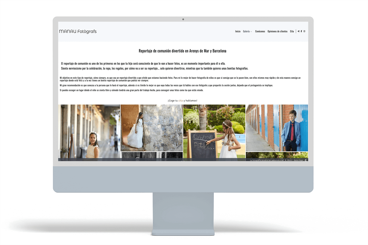
Manau Fotògrafs (Barcelona / Arenys de Mar) is a good example of communion photographer websites that combine storytelling with conversion. They have a Communion section within the gallery with text that is very family-oriented: they explain the typical nervousness of children, the goal of making the session fun, and recommend involving the child and choosing a place where they feel comfortable. This connects very well with the decision to hire a communion photographer.
In addition, they play the trust card very well: they have an extensive page of customer reviews (with explicit mentions of communions) and an “About Us” section that humanises the photographer and her way of working.
In the contact section, they have a well-designed form that includes “Type of event” with a Communion option.
Extra recommendations to sell more communion sessions:
- Make the “Communion” page more comprehensive (in addition to the gallery): packages, what’s included, duration, studio/outdoor, delivery times, and a mini FAQ (clothing, siblings, rain, locations).
- Add CTAs within the communions page: visible buttons such as “Request availability” and “Book an appointment”, not just a text link.
- Local reinforcement: include geographical terms such as “Arenys de Mar”, “Maresme” and “Barcelona” in the text to capture local searches for communion photography.
9# Miró Fotógrafos: Badajoz
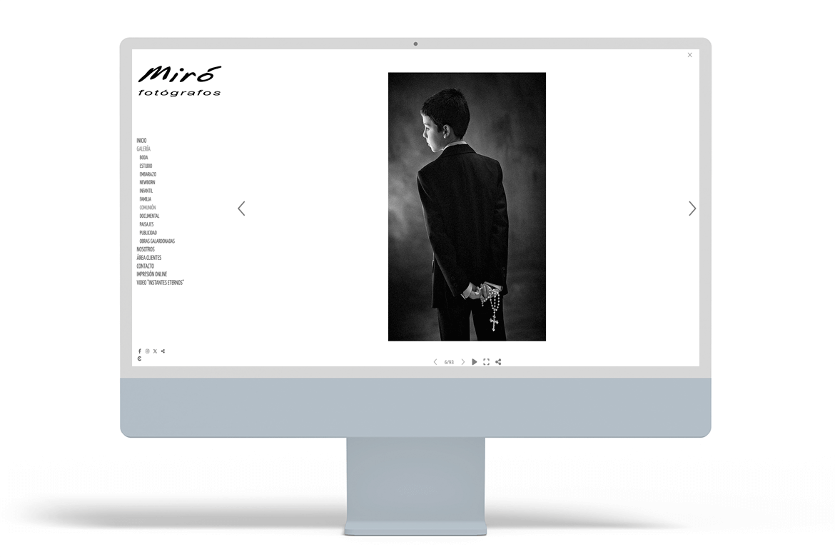
Having a well-thought-out structure of galleries and sub-galleries is key for communion photographer websites, especially if you offer many types of sessions. And that is precisely what Miró Fotógrafos does very well: from the menu, you can quickly access Wedding, Studio, Pregnancy, Newborn, Children, Family and Communion, as well as other categories such as Documentary, Landscapes and Advertising. This organisation reduces friction and helps families find examples of communion photos quickly without having to “navigate too much”.
Another interesting point is how they work on trust and branding: the “About Us” section tells the story of the studio and reinforces the human component (who they are and where they come from), and the website includes a Client Area for delivering reports privately, which enhances the experience and professionalises the service.
As a recommendation to boost sales of communion sessions, a brief service page accompanying the gallery would be welcome. It would suffice to add:
- What the report includes (studio/outdoor, duration, number of photos, album/copies, deadlines).
- A mini FAQ (clothing, siblings, rain, locations).
- Clear CTAs (“Check availability”, “Book a place”) within the communion section.
This way, the website not only inspires with images, but also guides families to make decisions and contact you with fewer doubts (and with more “indexable” content for SEO).
10# Vanesa Trinidad Fotografía: Madrid
Vanesa Trinidad (Madrid) has a very well-designed website to showcase a variety of work and, in that sense, fits perfectly into a list of communion photography pages: in the “Gallery” menu, she separates categories (Wedding, Pregnancy, Newborn, Children, Communion, Family, Fashion…), which makes it easy for a family to arrive and quickly find the type of session they are looking for.
In addition, her “About Me” section is very well crafted and provides something that greatly influences the purchasing decision: approachability, personal history, and values. In communions, that “feeling” weighs almost as much as the photos.
Under “Services,” there is a form with a “Interested in” selector where Communion appears, which is a good idea because it filters the enquiry from the first contact and allows you to respond more quickly and accurately.
Extra recommendations for selling more communion sessions:
- Create a specific page for communions (even if it is brief): what the report includes, options (studio/outdoors), delivery times, products (album, mementos) and a mini FAQ (clothing, siblings, rain, locations). This improves conversion and SEO.
- CTAs visible from the services page and the home page: “Check availability” / “Request a communion quote”, linking to the existing form.
- Add social proof near the CTA (2–3 short reviews from communion families) to reinforce confidence when making a decision.
With these adjustments, the website not only inspires, but also better guides families towards booking their communion sessions.
11# Puri Areán: Pontevedra
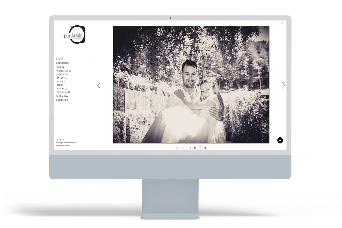
Puri Areán (Pontevedra) has a website that fits very well into a list of communion photographer websites for two reasons: clear structure and approachability. In the “Portfolio” menu, it separates categories (Weddings, Communions, Newborns, Children, Family, Pregnancy, etc.), which helps families quickly find examples of communion images without getting lost.
The Communion section features very customer-oriented text: it highlights the importance of the moment, offers sessions “in the studio, outdoors or wherever you like” and adds a direct call to action to book by phone or WhatsApp.
In addition, the “About Me” page builds trust: it tells the photographer’s story (including that they come from a family of photographers), talks about their experience, and shows images of the studio, which reduces uncertainty before contacting them.
Recommendations to boost sales of communion sessions:
- Add a mini landing page for “Communion Photography” with 4–6 points: options (studio/outdoors), what the report includes, delivery times, products (album/mementos) and an FAQ (clothing, siblings, rain, locations).
- Incorporate visible CTAs within the services page itself (“Check availability” / “Reserve a spot”) in addition to the text.
- Activate a customer area/private galleries to deliver the report in a convenient and professional manner (and make it easier for families to hire you again for children’s or family photography in the future).
- Extra quick: add 2–3 specific testimonials about communions near the CTA to reinforce the decision.
12# Raúl Sanchidrián: Ávila
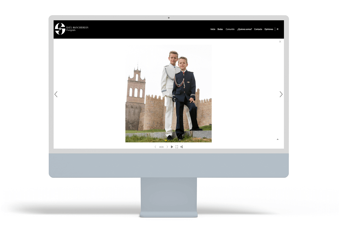
We close this compilation of communion photography websites with the website of Raúl Sanchidrián, a photographer with a studio in Ávila. The navigation is very clean and to the point: it includes specific sections for Weddings and Communion, as well as key sections to build trust such as About Us, Testimonials and Contact.
A particularly interesting point is the personal branding section: in “About us,” he takes a very emotional and documentary approach (“light, moment and framing,” “less is more”), which helps families understand his style before contacting him. In addition, having a visible reviews page greatly reinforces the decision, because it is exactly what many families look for when comparing photographers.
That said, to boost sales of communion sessions, the most direct improvement would be to strengthen the “Communion” section with more content reinforcing and clarifying what the packages are like, types of sessions, deadlines, etc.
Extra recommendations to convert more:
- Create a communion photography landing page with: what the report includes, options (studio/outdoor), delivery times and a mini FAQ (clothing, siblings, rain, locations).
- Add highly visible CTAs (“Check availability,” “Reserve a spot”) and repeat them throughout the page.
- Incorporate a booking calendar or, at a minimum, a specific form for communions (with preferred date) to reduce back-and-forth messaging.
- Offer online delivery with a private gallery (selection/download/purchase) to enhance the experience and open up extra sales (albums, copies, reminders).
Take the leap: create one of the best-performing communion photographer websites
The success of communion photographer websites lies in something very simple: helping families make decisions effortlessly. To achieve this, your website must clearly explain what you offer and what the experience will be like: an attractive, well-organised portfolio, your communion photography style, the communion photo shoot process (studio/outdoor, duration, locations, deadlines) and the packages available for this season. The easier you make it, the fewer doubts and more bookings you will have.
But it’s not enough to just show good communion photos. If you also anticipate typical questions (clothing, siblings, rain, schedules, delivery) with a small FAQ section and offer an online booking option or quick “availability check,” you’ll have a much better chance of converting visitors into customers. And the experience doesn’t end on the day of the session: delivery also sells. An online gallery where families can view, select, download or purchase extras (albums, copies, mementos) without having to travel improves satisfaction, reduces management work and increases your profitability.
Ultimately, a website designed for professional communication, booking and delivery not only helps you fill your schedule: it gets you recommended and ensures that customers return to you for future sessions.
These and many other business solutions are available at Arcadina and, in case you didn’t know, you can try them out for 14 days for free.
On this occasion, we are going to share with you the opinion of a wedding photographer who also takes photographs of communions and children’s sessions. His name is Ricardo Lozano.
>> ‘Arcadina Labs is the present’, Ricardo Lozano
And to say goodbye, here’s our question. Which communion photographer websites do you think best focus on these seasonal campaigns? You can leave their websites in the comments.
Arcadina goes with you
Fulfil your dreams and develop your career with us. We offer you to try our web service free for 14 days. And with no commitment of permanence.
Arcadina is much more than a website, it is business solutions for photographers.
If you have any queries, our Customer Service Team is always ready to help you 24 hours a day, 7 days a week. We listen to you.


I like how this article shows real examples instead of just talking about design in theory. Seeing how different photographers present First Communion sessions gave me a few ideas for my own portfolio, especially the softer, more minimal layouts. It’s interesting how much the overall vibe of a website can change the way you feel about the photos. Now I’m kind of tempted to refresh my own homepage a bit.